

The Power of Colours in Marketing
- Ben

- Mar 31, 2019
- 3 min read
Updated: Apr 12, 2019
Last week, I had a guest lecture by Sarah Owens, graphic designer and USW alumni, about the use of colours in marketing and design. It was a very interesting lecture, since she explained how the buying behaviour of consumers, but also the associations with a brand or product, can to a large extent be influenced by small, discrete signals that are unconsciously processed. Therefore, in this week’s blog I will discuss the psychology of colour marketing and how companies themselves can give the right amount of unconscious charge to their marketing communications with colour.

The effect of colour
When people buy a product, they often look at the colour of the product before they purchasing it. We also select the most beautiful fruits and vegetables ourselves when we are shopping in the supermarket right? Well, it is almost the same for brands. Due to the importance of identification, both for brands and consumers, colour plays an important role. Colour can not only seduce and provide identification for the proposed image, its strength lies primarily in provoking a purchase and contributing to brand loyalty. And if you don’t believe me and have doubts about the impact of colour for associations, do the next test:
Soda: bold red with white letters
Social media: blue and white
Fast food chain: one letter in bright yellow
Chocolate: fancy letter type in purple
Still having doubts after my test? Watch the video below; in which an illusionist manipulates the sub consciousness of his test subjects in a way that they will take an predetermined action that they would have never agreed with in advance. In the context of this blog; pay attention to the colour green.
Colour family Colours are not experienced the same way by all consumers. Yet cold colours generally have the effect to calm down and inspire confidence, while warm colours just stimulate and encourage action. Take a look at the visual below with the general associations people have with eight basic colours, that are often used in marketing. Maybe, it will make more sense why banks prefer to communicate in a cold colour as blue or why luxury brands often use black logos.

Let’s have a closer look with some examples of the primary and secondary colours:
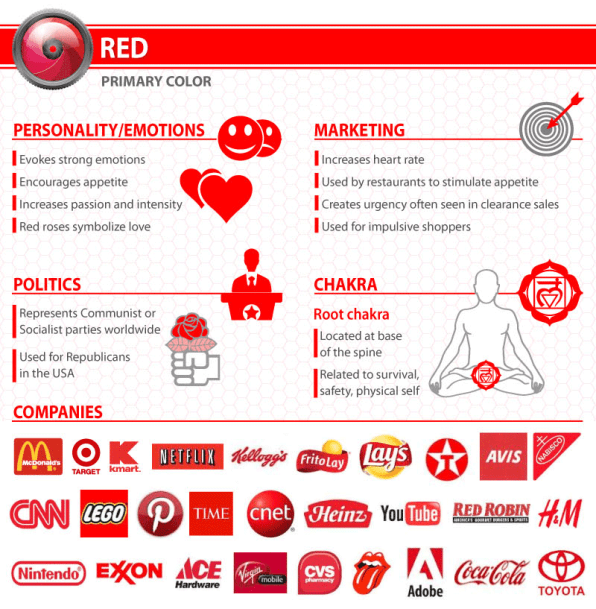
Red
Red is often associated with the heat of sun and fire and is considered a high-arousal color, often stimulating people to take risks, according to color think tank, Pantone. It has also been shown to stimulate the senses and raise blood pressure, and it may arouse feelings of power, energy, passion, love, aggression, or danger.
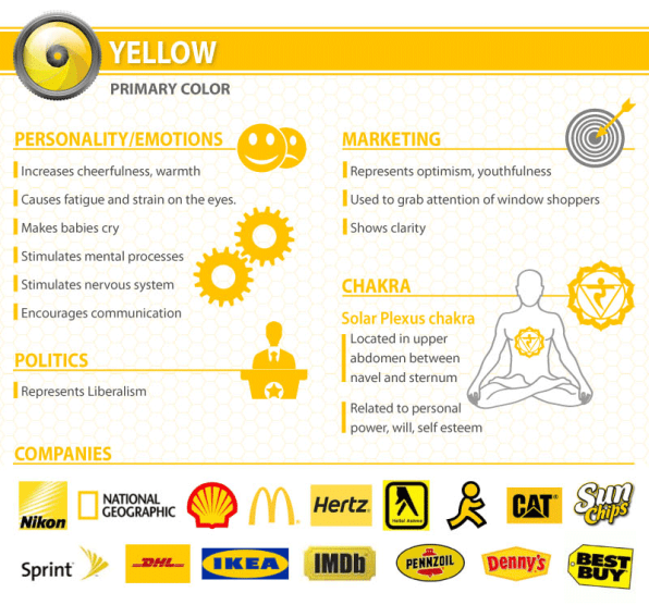
Yellow
Yellow is often associated with the heat of sun and fire and is considered a high-arousal color. It may stimulate feelings of optimism and hope or cowardice and betrayal.
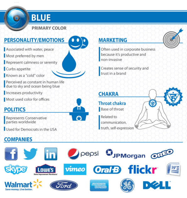
Blue
Blue is often associated with the coolness of the sea and sky. It has been shown to calm the senses and lower blood pressure. It may stimulate feelings of trust, security, order, and cleanliness.
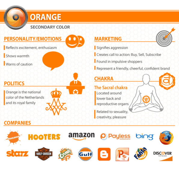
Orange
Orange is often associated with the heat of sun and fire and is considered a high-arousal color. It may stimulate feelings of energy, balance, and warmth.
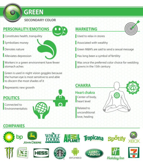
Green
Green is often associated with the coolness of leaves. People often associate it with nature, health, good luck, and jealousy.
Purple
Purple is generally considered a low-arousal color. It may stimulate feelings of spirituality, mystery, royalty, or arrogance.

Which colour should you use for your company and marketing?
It has become clear that the choice of colour of a brand is essential and must match with the identity of your company. So if you are hesitating or unsure what colour you could use, read the check list from Identic below as an extra help:
Does my brand fit within a specific register? If so what?
What image do I want my brand to convey?
What values are inherent in this image?
Will my potential customers identify with these visual codes?
Are my color choices sustainable and not linked to temporary fashion trends?
Well that was it! I hope you found the blog interesting and will be looking differently at colour uses in advertisements. Until next time!
Sources: TMM Communicatie and Comaxx


Comments